Top design tips to make your word document more beautiful, attractive and professional.
Professionals spend a lot of time working with word documents, but its not just professionals who have to work with word, even students have to use word for their projects and assignments.
GET INSTANT HELP FROM EXPERTS!
- Looking for any kind of help on your academic work (essay, assignment, project)?
- Want us to review, proofread or tidy up your work?
- Want a helping hand so that you can focus on the more important tasks?
Hire us as project guide/assistant. Contact us for more information
Be it a business plan, MBA assignment, project, or even your resume, you need to know how to use the various design elements, in order to beautify your word document.
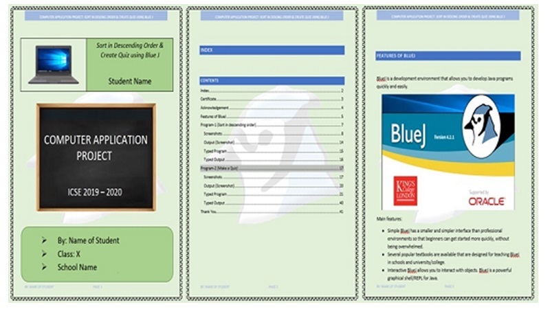
Even ICSE Class X students have to submit their computer project in a word document (you have to submit print outs of your project types in a word document). And you can easily wow the examiner by making a beautiful project in word.

So here you go, the various design related steps that you can incorporate in order to make your word document look better.
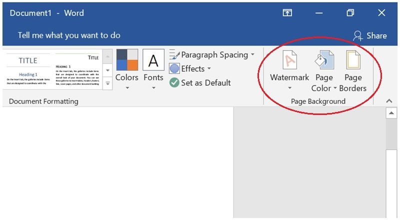
- Change the background colour of the document. It doesn’t have to be white, there is an option to change it.
- Have a border for document, you can have borders for each and every page of the document (you just have to set it once). The border doesn’t have to be a straight line; you can choose from various patterns
- You can set a watermark for the document (if you think its something that will make it better). The watermark can be text, but you can also choose an image or some pattern as the watermark.
This is where you set the documents background – colour, borders, watermark 
- Make use of Header and Footer. Whatever you enter here will appear on each and every page of the word document. The footer can have page number and the name of the student. The header can have the name of the project / subject name.
- Make sure you have a consistent font throughout the document. But for certain sections, paragraphs, you can use a contrasting font in order to make it stand out.
- Putting more space between paragraphs (double-space between paras) also improves readability. You can also get rid of unwanted indents.
- You can also shrink the Line Length, depending on what is the document all about. Magazines, books, and other professional publications usually have narrow line lengths, where it is not common for the text to stretch across the entire page. Widening the margins significantly may result in more pages, but it looks better and readers are more likely to go through the content of the document.
StudyMumbai.com is an educational resource for students, parents, and teachers, with special focus on Mumbai. Our staff includes educators with several years of experience. Our mission is to simplify learning and to provide free education. Read more about us.

Leave a Reply
You must be logged in to post a comment.