
INTRODUCTION
Coronavirus, which originated in China, has rapidly turned into a pandemic, quickly spreading to all countries around the world. The first transmission of Coronavirus to humans was observed in Wuhan, capital of Hubei province of China. Health experts believe that Coronavirus likely originated in bats or pangolins. Investigations have identified a seafood market, which also sold wild animals, in Wuhan, capital of Hubei, as the potential source of the outbreak. In China, all the deaths have been reported in Hubei Province – the epicentre of the virus outbreak.
Since the first few cases observed in the Hubei province, the virus has mostly spread through person-to-person contact. The disease can spread from person to person through small droplets from the nose or mouth which land on objects and surfaces around the person. A person can possibly get COVID-19 by touching a surface or an object (e.g. doorknobs and table) that has the virus on it and then touching his own mouth, nose, or eyes. The new coronavirus has spread rapidly across the world, prompting the World Health Organization (WHO) to declare COVID-19 a pandemic.
GET INSTANT HELP FROM EXPERTS!
- Looking for any kind of help on your academic work (essay, assignment, project)?
- Want us to review, proofread or tidy up your work?
- Want a helping hand so that you can focus on the more important tasks?
Hire us as project guide/assistant. Contact us for more information
Coming to the symptoms, people who have the virus may experience mild, flu-like symptoms. Most common symptoms are fever, dry cough, tiredness Some may experience severe symptoms, such as troubled breathing and can even lead to death. Serious symptoms include difficulty breathing or shortness of breath, chest pain or pressure, loss of speech or movement. The virus causes coronavirus disease 19 and hence it’s also known as COVID-19. Studies have found that the virus was closely related to a group of SARS-like coronaviruses previously identified in bats in China.
AIMS AND OBJECTIVES
a. To acquire knowledge and develop an understanding of the greatest pandemic faced by mankind.
Covid-19 is one of the greatest pandemics faced by mankind, and almost every country in the world is affected by it. The aim of this project is to get a better understanding of the scale of the pandemic, by collecting data available regarding number of cases, recoveries and fatalities, and analyzing it for better understanding on how fast the virus spreads and its fatality rate.
b. To acquire skills for accurate data collection and tabulation.
Before any meaningful graph can be made, its important to collect data from various sources. This project will help me learn how to find data from various sources and put them in various tables.
c. To acquire skills for representing data, which will make analysis relevant and easy.
This project will help me acquire skills to make different kinds of graphs based on the data collected. Line graphs, histogram, pie-chart, double bar graphs can provide useful perspectives on the underlying data.
d. To acquire skills for data interpretation and arrive at logical conclusions and inferences.
Once the various kinds of graphs are made based on the data collected, its important to interpret the graph correctly and make appropriate inferences, based on which suitable action can be taken. This project will help me develop those skills.
e. To be able to compare results of the spread and containment of the virus within and out of the country.
Once the various graphs are made, it will provide useful information on how fast the virus is spread, in India and abroad, and if efforts related to containment are showing results or not.
f. To acquire skills for utilizing collected data, to appreciate the manner in which governments function in order to control the spread of this lethal virus, and improve existing infrastructure.
Once Governments have more information about how the virus spreads (from the data and the graphs), they can take appropriate actions to arrest the spread of the virus by arranging for better infrastructure.
This will help health workers and strategists come up with their next course of actions to effectively contain the spread of the virus, treat patients, build the right kind of infrastructure, while researchers work on developing an effective vaccine for the vaccine.GET INSTANT HELP FROM EXPERTS!
- Looking for any kind of help on your academic work (essay, assignment, project)?
- Want us to review, proofread or tidy up your work?
- Want a helping hand so that you can focus on the more important tasks?
Hire us as project guide/assistant. Contact us for more information
g. To appreciate the health workers that run the risk of losing their own lives, while controlling the spread of this virus, and curing patients.
The virus spreads from person to person and has already claimed so many lives around the world. So, I really appreciate the health care workers for putting themselves in the line of fire to protect others from the virus.
h. Finally, I also appreciate citizens of our country, many of whom have been generous by donating, time, cash, food, etc to the needy during these trying times.
METHODOLOGY
Data collection: The data is to be taken from, WHO STATISTICS ON COVID 19. The data collection starts from (March 12th and ends on May 30th). The data is confined to number of infected persons, number of Recoveries, number of deaths. This master list of data has been used to create all the graphs in this project.
Data for various Countries for the period March 12th and ends on May 30th.
Graphical Interpretation, Views and Opinions
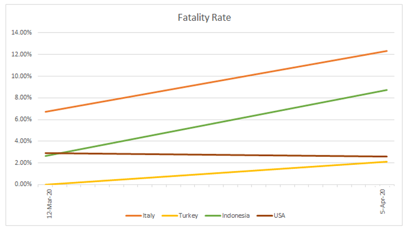
a. From the line graph, USA shows the biggest spike in positive cases between the period 28th March to 5th April.
Possible reasons
- Not enforcing lockdown soon enough
- People not wearing masks when venturing outdoors
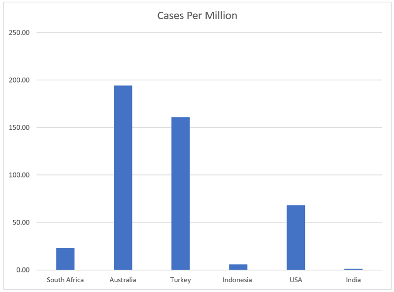
b. From the histogram, based on a population of 1 million, the worst affected country seems to be Australia.
Possible reasons:
- People were breaking the rules, many were still going to work while sick.
- Many also were flouting lockdown rules claiming it was a breach of their human rights.
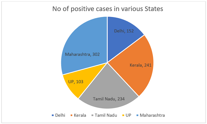
c. From the pie chart, one can see that the highest cases recorded were in the state of Maharashtra.
Possible reasons:
- City like Mumbai has a huge population
- Being the financial capital of India, it’s difficult for people to stay indoors
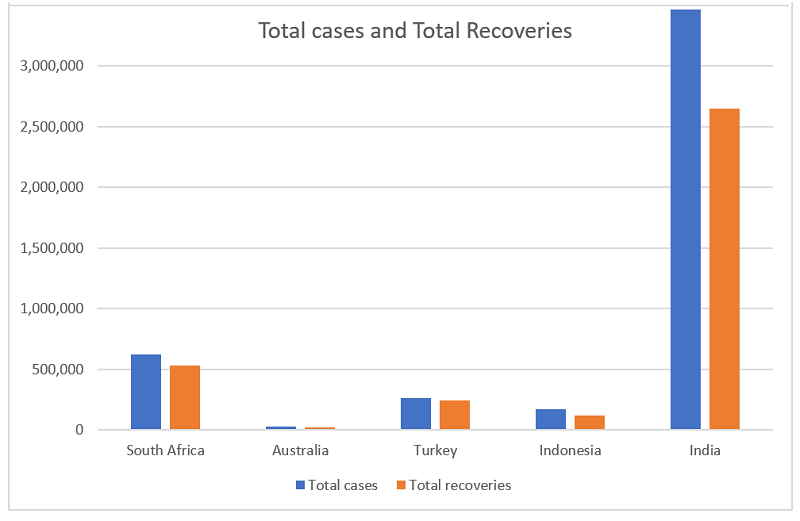
d. From the double bar graph, it seems that Turkey has a slightly higher percentage of recoveries.
Turkey has some advantages in the fight against Covid-19, including a bigger young population, and a high number of ICU beds in its hospitals. There also seems to be better coordination between the various agencies, and the country has also increased testing among people.
Indian Perspective
India seem to have handled the crisis well, especially if you consider the fact that it is the second most populous country in the world and yet it has a very low number of deaths per million.
India didn’t wait for the problem to escalate and enforced a countrywide lockdown quite early on when the number of reported coronavirus cases was just over 500. Besides increasing the testing capabilities, India also followed a painstaking contact-tracing process. Drones were deployed and mobile tracking was used to track movement of people.
People also contributed generously to the Central government and the state government relief funds. Many came out in large numbers to provide food and other relief materials to daily wage workers, and to arrange for transportation to migrant workers who wanted to go back to their native place.
Project Details
Assignment Question
1. INTRODUCTION : ( origin of the virus , mode of transmission , symptoms etc. 60 – 100 words)
2. AIMS AND OBJECTIVES.
- a. To acquire knowledge and develop an understanding of the greatest pandemic faced by mankind.
- b. To acquire skills for accurate data collection and tabulation .
- c. To acquire skills for representing data , which will make analysis relevant and easy.
- d. To acquire skills for data interpretation , and arrive at logical conclusions and inferences .
- e. To be able to compare results of the spread and containment of the virus within and out of the country .
- f. To acquire skills for utilizing collected data , to appreciate the manner in which governments function in order to control the spread of this lethal virus , and improve existing infrastructure .
- g. To appreciate the health workers that run the risk of losing their own lives , while controlling the spread of this virus , and curing patients .
- h. To appreciate citizens of our country , who have been generous , by donating , time , cash , food ,talent, etc .
3. METHODOLOGY
a. Data collection : The data is to be taken from , WHO STATISTICS ON COVID 19
The data collection starts from ( March 12th and ends on May 30th ) **
The data is confined to number of infected persons , number of Recoveries , number of deaths.
b. Graphical representations : on 2mm graph paper ( 2 sheets can be pasted adjacently , if data specifications volume is large ) , graphs can be folded neatly into the project journal . Graphs must be neat and clear and accurate . graph types will be, line graph , bar graph , histogram , pie charts.
c. Details of the graphs : 1. Plot a line graph from situation reports* for a period of 25 days of 4 countries * that have been affected with fatalities ( deaths) . y axis total fatalities , x axis days ( 25 consecutive days )** the countries referred to should not differ too much with number of fatalities as representing would be difficult on same graph.
2 . Plot 2 reference lines on the same graph, for 40 deaths every 2 days And 80 deaths every 2 days , these lines can be used to show Countries which are affected to a larger extent .( ref lines can be For 20 deaths or 60 deaths every 2 days ) , in order to match with. The data collected . For each of the 4 countries calculate and record Fatality rate on day 1 and day 25 .
3. Plot a histogram to represent 6 countries , showing number of Infected persons per million of population , for a particular time Frame according to the given data . ( 6th country is India ) Y axis population X axis countries
4. Construct a Pie chart using 5 states of India , showing the number Of positive/confirmed cases . ( 5th state is Maharashtra ).
5. Construct a double bar graph , with any 5 countries , to show the Total cases and total recoveries . ( 5th country is India ).
4. GRAPHICAL INTERPRETATION : a. From the line graph , find out which country had the highest VIEWS AND OPINIONS spike in positive cases , within a specific time frame. ( write in point form ) State 2 possible reasons for each occurrence. b. from the histogram , find out which country is worst affected, based on a population of 1 million. State 2 possible reasons for the occurrence. c. from the pie chart find out which state has the highest cases Recorded , state 2 possible reasons for the occurrence. d. use the double bar graph to suggest which country has an Effective medical infrastructure , that has proved its worth , in Controlling the spread of the disease ,during this crisis .
5. INDIAN PERSPECTIVE : ( 80 – 100 words ) on how was the crisis handled in our country ( paragraph ) include innovations in engineering , medical innovations , in the treatment of infected persons , corona warriors , contributions of the generous citizens of our country , by way of cash , food etc.
Data collection details
A. from the situation reports collect data for a period of 25 days ,** For 4 countries in different regions * , list the total number of Confirmed cases and total number of deaths . ( daily report )
B. for one particular day ** , list the number of confirmed cases per ,million of population , of 5 countries in different regions * , include India as the 6th country.
C. for one particular day ** , list the number of positive cases , from 4 states of India , include Maharashtra as the 5th state .
D. for one particular day ** , list the number of cases , along with the recovered cases , from 4 countries , include India as the 5th country.
E. find the mortality rate of 6 countries in different regions*, include India as the 7th country, in order to compare , mortality rate on a particular day . ** ( need to record deaths and cases confirmed for purpose of calculation )
MATH PROJECT F A Q s
1. Can I obtain data for the months beyond May 2020?
Yes , data for the month of june and july and august is easily available , please use the same if you need to .
2. How do we plot a figure as 25,49,682 ?
You can round it off to 3 significant figures to be 25.5 lac.
3. What if data is falling out of the graph paper ?
You can use another scale or attach another graph paper neatly pasted and aligned with the first graph paper.
4. Cases per million , recoveries and deaths are presented in a time frame ( 3rd to 16 th Aug ) can this be used ?
Yes , this can be used instead of data for one particular day , as given in the guidelines.
5. Can we use data that is already plotted ?
No , graph work needs to be done , and not ready made.
6. Apart from the WHO site can we get information from somewhere else.?
No , information to be obtained from WHO only.
7. Under situation reports do we record the new cases and the new deaths that have occurred. ?
No , look at total confirmed cases and total deaths as on that date.
8. Do we tabulate the data before plotting .?
Yes . all data to be tabulated before plotting as illustrated
Countries Cases per million Rounded off 3 s.f.
India 25,49,682 25.5 lac
xxx 8,43,920 8.44 lac
9. Can we add colour to the graphical representations ?
Yes . please use colour , light shades , so that vital information is not drowned . label the graph using black ink pen only ,clearly and neatly, with the date of the info.
10 . Do we use the same countries as stated in situation reports , for cases per million , recoveries etc . ?
You can use different countries /regions of your choice , need not adhere to the same 4 countries as stated in situation reports . ( collect data that can be plotted easily)
GET INSTANT HELP FROM EXPERTS!
- Looking for any kind of help on your academic work (essay, assignment, project)?
- Want us to review, proofread or tidy up your work?
- Want a helping hand so that you can focus on the more important tasks?
StudyMumbai.com is an educational resource for students, parents, and teachers, with special focus on Mumbai. Our staff includes educators with several years of experience. Our mission is to simplify learning and to provide free education. Read more about us.

Leave a Reply
You must be logged in to post a comment.