Data Handling (Math) Class 4 notes, concepts, worksheets, questions and answers.
The collection, sorting, arrangement and presentation of information is known as data handling.
GET INSTANT HELP FROM EXPERTS!
- Looking for any kind of help on your academic work (essay, assignment, project)?
- Want us to review, proofread or tidy up your work?
- Want a helping hand so that you can focus on the more important tasks?
Hire us as project guide/assistant. Contact us for more information
Reading and understanding data that has been presented using pictures and diagrams is much easier.
Pictographs
A Pictograph displays information using pictures. Here, data is represented using pictures, graphs, icons, symbols, or pictures.
A pictograph is also referred to as pictogram, pictorial chart, pictorial graph, or picture graph.
Examples
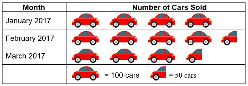
Given below is the number of cars sold by an automobile company in the first three months of 2021.

From the pictograph, we can easily tell that:
- In the month of January, the company sold 400 cars
- In the month of February, the company sold 450 cars
- In the month of March, the company sold 350 cars
Bar Graph
Similar to pictographs, a bar graph is also used to display information. In a bar graph, information is shown using rectangular bars.
There are two types of Bar Graphs – Vertical Bar Graph and Horizontal Bar Graph.
Examples
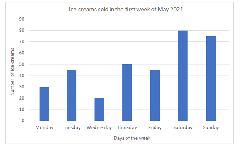
Number of Ice-creams sold by a vendor during the first week of May 2021.
Monday – 30, Tuesday – 45, Wednesday – 20, Thursday – 50, Friday – 45, Saturday – 80, Sunday – 75
In order to construct a bar graph, we need to have a scale for reference. The scale needs to have graduations making the quantities to be shown. In this case, we can have one graduation representing 10 ice creams sold. The different bars for the different days of the week will be as long as the number of ice-creams sold. More the ice-creams sold, longer the bar will be. The top of each bar must be in line with the correct number of ice-creams on the scale. For extra 5 bars of ice-creams sold, the bar will be longer by half a mark on the graduated scale.

This is an example of a vertical bar graph. In this vertical graph:
- The title tells us about the information that is displayed on the graph
- ‘Number of Ice-creams’ is the label on vertical scale.
- ‘Days of the week’ is the label on horizontal scale.
Just like a pictograph, we can read any information using a bar graph. The bar graph gives us the following information:
- Most number of ice-creams were sold on Saturday. i.e. 80 ice-creams
- Least number of ice-creams were sold on Wednesday, i.e. 20 ice-creams
- Same number of ice-creams were sold on Tuesday and Friday, i.e. 45 each.
- After Saturday, maximum number of ice-creams were sold on Sunday, i.e. 75 ice-creams
StudyMumbai.com is an educational resource for students, parents, and teachers, with special focus on Mumbai. Our staff includes educators with several years of experience. Our mission is to simplify learning and to provide free education. Read more about us.

Leave a Reply
You must be logged in to post a comment.